Friday, December 18, 2009

epilogue

There was no "done" in architecture, and this review again was a reminder that things never get completed. The recent couple of weeks were not a finishing process but stopping at what we have now.

Due a lot to lack of sleep I wasn't able to remember/summarize thoughts we have had for the semester. Yet through presenting at least what we want to say about our project, I think we had good conversations about what we should do next.

Overall the review (both morning/afternoon) asked some questions in common.

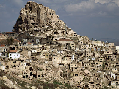
: what is the rule that enables the field condition happen in our building? now the school look like maze (which has lots of walls in it). Isn't the space has to be almost without walls?

: plan and form of the building which doesn't clearly conveys constantly moving field condition

The focal point we had in our plan was mainly about making classrooms arranged in order to have hangout space in between. Yet I agreed that the overall arrangement should have been coordinated with other elements of building as well. I regret the thinking process didn't continue up until yesterday as we had to produce things for reviews.

To me it has always been such a big burden and effort to "create" something, however at the same time it is a true gesture in which I can express myself in different ways: and it seems as I repeat the process the outcome gets better.

Life with architecture will go on :)


Saturday, December 12, 2009

12/12/09 Toward final

Final renderings of the plan view: shows the light condition of each space.
(context buildling should be poched)

1F


2F


3F


In each plan, the floor right above was treated as an invisible object but still affecting the light condition.

Saturday, November 28, 2009

11/28/09 "Rocky" plan

Below are "rocky" version of our final plan.


Mainly it explains both program and structure at the same time. Fixed programs are all poched, and among those fixed programs there are rooms that work as structure system- these are shown by thicker walls.

The reason we had all doors to room look like small pathways is that it's better to show how program can spill out: Fixed programs don't actually have completely closed part, but still can be pretty secluded area by having small pathways.

The plans are going to be rounded up (or be smoother) as it is being settled.

Tuesday, November 17, 2009

11/17/09 subtraction

Three types of spaces are now defined by one another. It's a subtractive way to think of space.


Thermal Bath is showing this idea well. By thinking certain programs as solid blocks, the rest of space is formed. The benefit of doing this is that it generates an "clearly-recognizable" design. Without having one to one relationship between space type and its apperance. (i.e. fixed for circle, fluid for triangle, program+circulation for square)


I treated this model as jello again, in rhino version. After removing all floor plans, I made a box and perforated with cone-shaped columns: which is going to be void space in the end.
And then in order to keep the floor slope, I created two big planes with same slope from the webbing circulations. so the floors are the result of subtracting columns from those planes.


The work is better shown in plan view. I like the point that the size of void space slightly changes between floors. And overall it looks as if the void space is actually subtracted. However at the same time it doesn't look right to me, still. Fixed space are shown as solid, program+circulation as gray, void as white. ( Not sure if we need to mark fluid space with orange color.) I think it is because all types still have their own shapes (rounded corner rectangle and cone)

I still need to consider structure and light matters as well.
(Yet they are not a one-way progress but an interactive concerns)

Saturday, November 14, 2009

11/12/09

space: adjusting(organizing) itself to constantly changing field condition

At review, we were at the first trial of delivering the concept to actual space. After placing our general agreement ( auditorium on north west, cafeteria on south, library at front, administration center on center, etc) we added webbing surface in order to create circulation as well as light hole. By doing this we intended to combine our former light analysis and design concept.


Overall I satisfied the fact that Laura and I have been trying to convey idea through various diagrams and materials - which made the project more fascinating to ourselves and also to critics. Even though we had two groups of critics and some of the questions were different, I think both groups of critics were trying to ask us a couple of points in common: How this space actually works, and how we can express this concept better in drawings.

One thing which I am still questioning myself was also how this space would be like eventually.
We sorted out fixed/fluid/circulation+program , yet I thought there should be more descriptions - we can possibly use a time table to show the morphing usage of space in each time period.

Also by changing thickness of walls, width of corridors, and rounded corners the space would look much more dynamic. In addition, I hope we can create several images for plan - fixed as poched space and fluid as white space- showing change of plan even within physically determined condition.

One interesting point was that every team was using sun diagram as a form generator, though the analysis part was pretty much same for everybody. It was good to see every team's idea gradually forms in diverse ways from such similar beginning.


need to improve!
- be more specific, how could that work actually?
- conventional drawing is not sufficient for us, find other strategies for doing this
- lighting strategy, where to put hole on the roof top?

Sunday, November 8, 2009

11/07/09 architectural interpretation

The concept of three different types of space is settled, now the question is how we can translate that to architectural words. It is still hard because, even though the space is being classified, there are still many overlaps which we cannot define either as Fluid or Program+circulation


.


At this point we had a promise like above: Fixed program as a solid box, Fluid program as a box with at least one side open, and Program+Circulation as a plane.

Thursday, November 5, 2009

11/05/09 actualizing diagrams to real space

Through having pin-up I was able to see several distinctive approaches of design suggested by each group. While Laura and I were dealing a lot with setting concepts and making diagrams, some other teams were making actual interior space, or analyzing site condition more deeply. I guess open-ended condition of our project we had at the beginning enabled all of us to search for different ways to think about.

Other than having nicer layout- making printouts bigger to easy to recognize, utilizing both printed and ppt slide at the same time- I think until Tuesday we were still up on the air, not having certified space arrangements yet.


The pie chart and detailed grouping of given programs eventually enabled us to realize how much space are actually going to be "fluid". Realizing that there are many fixed space (i.e. office, storage, workroom), we tried to maximize area for both "circulation-program" and "fluid".

Classroom, in fact, has lots of potential to be overlapped with other space, by clarifying activities going on inside. If it's a room for cooking class, it might easily be mingled with dining hall area.

We are now searching examples for these fluid space, and at the same time constructing rhino model with these three categorized space - fixed, fluid, circulation+program.


Tate Modern Gallery in London has big void space without a certain program. Instead, people pass through to get to other room, sit down and talk, listen to lecture. This is a good example of space which has circulation and fluid program simultaneously.


Saturday, October 31, 2009

10/31/09 Form -> Circulation

The idea we are trying to convey through the design is this
: space grows and shrinks by people's movement

After constructing some study models, however, I realized there is still not much logics in the circulation yet. Though the idea is clear and we already determined general distribution of public/individual space, there is no system that moves people around the building.


Each mass above strongly expresses what it wants to do in their design. "Donut" building wants people to move around, creating center space as gathering, while "square" building frees people from certain direction (like crown hall). Each has its strong representation of its characteristic.

At this point my opinion is that we can think of form first, and then putting programs into it. It seems things are never going to be realistic without determining certain appearance first. I remember last semester (we were designing Detroit Cruise Terminal) we had time to make 20 mass models in a day- these models were pretty simple though, such as a crumpled paper, one big chunk of pink foam, etc. Through this quick form generating process I was able to start from some amount of restraints.

So now I'm thinking about the best form for growing/shrinking space.
(But still can't fully imagine how space can actually grow and shrink) :(.. I'm stuck

Wednesday, October 28, 2009

10/28/09 Mid-point Summary


I think it is time to shrink our idea concisely


Even though we have come up with various ways to work on this project (having unit based model, playing around with digital project model, stacking up strategy of classrooms, jello model idea, etc) and certainly they all are good trials, we both felt we jumped around with only few constant ideas.

It's not that we are going to continuously focus only on the classrooms. But if I can tell people our concept as one sentence, I would say "We aim to create flexible school space": which is the latest conclusion we made yesterday with Karl.
(It's also interesting to remember we were looking at futurist paintings and expression of movements at the beginning, giving some connections to what we have now)


In Shigeru Ban's naked house there are movable boxes for each family members.
These box shaped rooms provides infinite possibilities of arranging them.


By saying flexible, I meant to create space without only one kind of given program. The word flexible could actually mean movable space (i.e Shigeru Ban's naked house), but we decided to think of that word as more programmatically. At one point gym and hangout space can be one area, whereas another time the same hangout space can be linked to library : programs are pouring their quality to their adjacent space. Even some programs can be used as circulation as well. This will lead us to have fixed but flexible space as far as program matters.


We are now setting up these possibilities among programs. programs which are fixed, or being overflowed, mixed with circulation. This diagram would let us start building real space and study model based on its rules.

Additionally, I hope we can carefully join our concept with sunlight analysis eventually- creating bright classrooms though they are not all on the top.

Sunday, October 25, 2009

Example: Diagram of time and movement of people


These diagrams are from one hospital design process in South Korea, indicating people's movement in a day. The first three diagrams are classified depending on age of people, and the last one is the combination of all of them.

There are lots of parameters we need to think of:
different group of people, time, movement, public/individual characteristic of space

I think this is the type of diagram we are in need of, since we do have groups of grades and different time table from each group. By doing this we would be able to realize what is the main activity among the groups, how big that has to be, and where to put the program for easier movement.
( It would be interesting to have animated diagram that Laura suggested, instead of showing static images like above.)


10/25/09 program.?


Now I remember one important message of someone from my old school, a couple of years ago, that the original school started from "The student and teacher starting conversation under the tree". The definition of school was never defined by space but by the actual activities going on in school area.

I realized how I was stressed out to make all programs arranged properly- struggling to make circulation only to connect programs. It was almost a stubborn decision to set up all programs settled first and try to connect them.


During this weekend I started doubting what we call as programs. We already got specified programs- classrooms, therapist workrooms, auditorium, gym, and cafeteria.. etc. However as long as we keep the activity in each program, I thought we don't need to classify spaces depending on these programs. (This also reminded me of my high school years how easy it was to switch classrooms to exhibition places or any other different purpose-serving areas.)

This is when I started to set my own way of defining program: honing into primary acts that people do in school. They are: Thinking, Listening, Displaying, Inventing, Moving, Talking
These are not even specific activities only for school, thus it gives a possibility of creating space open to its program.


Each basic activities are distinctive. In contrast to thinking (the thing we do by ourselves) , talking is a very socialized gesture. The place where we talk will be more public space than where we go to think something.


By looking at one example of time table, I was able to break it into primary acts. And depending on whether the acts are social or individual, I set up vertical levels for different characteristics.
This time, since the arrangement is only defined by people's basic acts, we are free to place real programs anywhere. For there are various types of classrooms too, classrooms can be either in the first floor or the top floor based on if it's a place for individual work or social activities. ( Just like jellies in Jell-o) :)

Tuesday, October 20, 2009

10/20/09 Grouping strategy


After creating a few blocks for each program, we placed them thinking specifically of grouping grades. It eventually created a cluster of boxes, which I think we wouldn't get much ideas of massing out of it.


So we switched back to rhino model again, which looks like we are kind of back to our preliminary concept. From those diagrammatic configuration, however, we are going to "condense" classrooms so they are not spreaded all over the site. Condensation includes: pairing, stacking and narrowing the gaps between them. This will enable us to have more voids in general.

After constructing iterations and picking our favorite tomorrow, we will be back to Digital Project model, developing accurate model further.


Saturday, October 17, 2009

10/17/09 DP


We are finally in the step of having Digital Project model. Our design is quite easy to manipulate in parametric modeling system, since it consists of unit and the form is determined totally by arraning units.
Squares are classrooms, and rectangular pieces represent other programs. For specified program we were given a couple of days ago, we decided to have several blocks for each program: We took into consideration whether the program has to be divided by three groups of school (individual) or shared by them altogether. (Yet they are connected as well)

Friday, October 16, 2009

Case Study: North Kildare School


It was very fortunate for me to find out this school, since it deals similar matters that we have concerned about.


North Kildare Educate Together school in Ireland, was built for making normal kids and autistic kids stay together. Yet they are supposed to be separated at the same time in curriculums and activities. ( Also for safety for normal kids.) Having these two big conflicting issues, the designer might have thought much about how shared and individual space is related one another. It is just as we are doing now, grouping students in a big name of k-8 school.


The architect's strategy to mix and isolate students was quite straightforward, in my view. What he did was to have one entrance connected to main courtyard , but having separate classrooms all around it. Also for different activities each classrooms has their little garden behind. In plan view programs are distributed having the public courtyard in the center. The overall appearance of the school, therefore, doesn't have strong outstanding features.


The fact that the school reacted quite easy to given condition makes me think a bit easier to our massing process. Often times I feel weird when things are straight and simple. In the progress of arranging programs I would have to be careful to answer to given matters in direct ways, rather than considering too much about nice looking surfaces and secondary decisions.

Monday, October 12, 2009

10/12/09 the 4th Evolution


The diagram above shows the overall process of our design.


Starting from classrooms, courtyard and lightwell, the first plan was about making configurations with these 3 elements. Those drawings look very diagramatic and conceptual, which was actually the situation for the previous review.

In second step we began arranging classrooms based on the grades, creating horizontal connection among same grade while arraying each grade from top to bottom. We dealt a lot with circulation in the second process: how we can create both vertical and horizontal circulation without interrupting the lightwell, what other strategies we can use in order to make more practical form.

From the third attempt of revising we thought about grouping grades, so the buidling got easier to solve circulation (by having major 3 elevators on each group). Still the major concern was to make classrooms get the most sunlight during the day.
(I think putting classrooms on the surface of building not only enables them to get much light but also blocks them from the subway noise, which is good).

At this point we are in 4th evolution of plan/section. We went back to unit-based configuration again, and it consists of two boxes and one connection between them. This unit based model would create a "monolithic" gesture while providing "flexible" ways of how this building works. Variations shows the possibility of changing unit either as outdoor or indoor space. In addition, having different shapes of connections would give us chances of different forms.
Tomorrow we are going to discuss the rendered model of each unit-based models and see which one works best.


Friday, October 9, 2009

10/09/09 Future of design, future of education


To me the image of school has always been similar to the picture above.
We used to sleep during classes - which is inevitable since my high school system wanted us to come before 8 a.m and stay until midnight . However the other reason for sleeping in school was that students were not so much interested in other subjects unless they are important. By important I mean those which appears in exams.


It was directly connected to the question in TED's talk, School kills kids' creativity : Why have we been learning math more than we have learned dance? Why is some subject more crucial to go to college than some others?

While processing design strategy I had a chance to contemplate about what we are doing here. It is certain that we are not creating simply a nice looking space. The school design that Laura and I have been struggling to figure out is not just a matter of space itself. Therefore it was insightful enough to watch TED's talk and listen presentations today in Future of Design and think what this school is supposed to be.

Though (to be honest) I was sleeping on many presentations I like the idea from Margaret Stewart, who insisted that the design in the future is going to give tools to people. At this point in education there is a clear hierachy in subjects. Instructions are given from the beginning of school years to students what they should be good at. Montessorri school we visited in Chicago was one exceptional system of school, giving children an opportunity to make their voice.

What are the questions we need to ask ourselves in order to make this "freedom" of design? How can architecture work as a method of improving our current education system? I hope I could get closer to those answers by having more chances of listing presentations tomorrow.

Wednesday, October 7, 2009

10/07/09 Some points from Chicago visit


Millennium park, works by Frank Gehry:
- seemingly random form but carefully planned structure behind.
- created inner space without walls


Glass wall: thicker supporting in the middle because of the bigger moment they get in the middle


Comparison of the oldest masonry building and Mies's building:
- Building construction as a subtractive way, and as a structural way.
Mies's design:
-aligned lighting system, grid system
- Corner of buildings: enable us to recognize whether this steel frame works as an actual structure or just an ornament

Mccormic Tribune student center in IIT:
-ramped staircase
-how color and texture of the building defines the space.
-subtle difference of the center in section view
-reflecting the road outside, creating circulation


Montessorri School
:" the task of childern is to get to know themselves."
making kids motivated by letting them do what they want to do.
pedagogical concerns are reflected in designing school.
placing older grades on the top
use of corridor as children's working space


Monday, October 5, 2009

10/05/09 "Forming" school

Switching our working method each other, I started to build a rhino model instead of working with pink foam. This time I decided to concentrate mainly on the form - how to make it into a better looking surface, and how to adjust programs into it.


Alternative 1 is where all boxes indicate both classrooms and other programs. Though I made color distinctions in rhino model, this rendered view would not show which is where. And this could be an intergrated form of programs. Lightwell this time is not created linearly but still is located very sporadically. People in downstairs might as well get enough light through this.
( This time I originally set up the maximum height of building as 4th floor, preventing myself from creating classrooms way above). However the form, or the surface doesn't reflect any of those sunlight analysis.

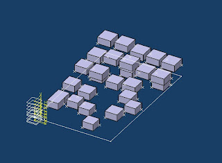
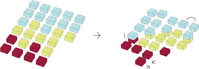
Alternative 2 suggests very smooth arrangement of programs. It almost creates one big surface where the courtyard is higher than any other space, classrooms are going down again to create staircase-like-courtyard. This time again lightwell is created by cracking between the array of classrooms. Last week we proposed public space as bigger boxes but I thought that public space could also be fragmented into smaller boxes- which again helps integrated form.


What I pulled out from those two suggestions is the third alternative. Smooth surface is generated by all boxes and there are developed lightwells in between classrooms. What I added here is that these light wells get bigger as it goes down to the south and eventually make one big void. (It reminded me of tessellation that Laura suggested the other day.) It enabled myself to think about space not defined as a box, but as a flexible form created by other space. This void can later be either a big courtyard or an outdoor field.


Friday, October 2, 2009

10/01/09 Classrooms, Courtyards, and Lightwells


#.1
Our main concern was to maximize the sunlight on classrooms, creating lightwells between arrays of classrooms so that semi-public spaces underneath them could get decent amount of light as well.
#2.
It is one of the essential skill for architecture student to manage given time.
My thought is that due to the failure of managing time before review (Thinking and discussing for a long time but not executing models/diagrams in better manners), we (I) werent' able to convey the idea of project as a whole. By saying "as a whole", I meant we were still in quite conceptual status not considering enough about secondary matters in design. In a way we succeeded in arranging classrooms to get the greatest amount of sunlight, yet we haven't gotton any clarified suggestion of what circulations might be, how other public area could be arranged, and even how tall this school is going to be.


Ellie recommended me to look those cliff dwellings in Cappadocia, Turkey, to see how to adjust forms into its condition. Our school's monolithic array of classrooms stood out in too extreme way, as opposed to those Cappadocia dwellings carved out of nature. Public area in front of those classrooms should also be harmonized (not making stark difference at least).

It was good to think about the light and the location of entrance though. What I learned from other's presentation is that we also need to consider the light in very constant way. Sunlight is not a section but a gradiation, so it was good to point out that the building should be aware of this gradiant movement rather than thinking only by our shade sections.

In summary, we would have to improve

- How the actual building might work while keeping our concept
- Reconsideration of form
- Parts to whole relationship
- (additionally) clarifying each amount of natural light and artificial light
- (it's personal) presentation skill


Monday, September 28, 2009

09/27/09 a couple alternatives of program distribution


We have 3 issues(parameters) important on our site:
light/darkness, individual/shared, and time

Laura and I have been constructing diagrams- one for the relationship between light/darkness and individual/shared, another for relationship between light/darkness and time ( I think this is what Karl called "designing program", since we are defining programs in our own way).

Of all three important issues we are supposed to take light/darkness as our priority. ( guess it might be as same as the rest of the team) Yet we both agreed that we are putting as much light as possible into our school. And if so, I didn't think we need to worry too much about massing. In a way the building mass can be very similar to "mountain dwellings" in copenhagen. Thus how we can connect shared/individual space in such premise will give us our own specified design.

What I have been doing tonight was some sketches for the program distribution . In the sketch I marked all shared spaces as yellow while individual spaces are white. Light/darkness strategy is shown in the section in which the mass on north is relatively higer than south. shared/individual strategy is shown in diagram in the middle. I tried to make a reasonable connection between individual rooms and shared rooms. (For instance we need to make every student to get to courtyard easily, without having any student to cross other classrooms)


It's always hard to make fast progress from the beginning, yet it seems we could clarify ideas and design strategies faster as time goes by.

Thursday, September 24, 2009

09/24/09 In between analysis and design


For a couple of days from Tuesday, we have been creating 6 sets of sections for the site again. Compared to the previous one, this section includes the shade only for the site. By arranging shades along the time and month we were able to see the gradual change of shades as well as stark difference of shades depending on the time (whether it is 8 in the morning or at noon.)

We also worked on the desired amount of light in each program. Classroom might require much more light during the class than the very in the morning. For dining hall it doesn't have to be bright everyday except for lunch/snack time.

By setting up our own conditions of programs and placing them into right spot in the site, we are expecting mass strategies out of it. (This probably is the thing we should have done already, yet we feel better that we made a clear analysis which is going to be helpful throughout the whole process)

What I am planning to do is to try as various material as possible for making physical model. Clay, Pink foam, card board, anything works better with constructing "A chunk" would be a good material to deal with.