Friday, October 2, 2009

10/01/09 Classrooms, Courtyards, and Lightwells


#.1
Our main concern was to maximize the sunlight on classrooms, creating lightwells between arrays of classrooms so that semi-public spaces underneath them could get decent amount of light as well.
#2.
It is one of the essential skill for architecture student to manage given time.
My thought is that due to the failure of managing time before review (Thinking and discussing for a long time but not executing models/diagrams in better manners), we (I) werent' able to convey the idea of project as a whole. By saying "as a whole", I meant we were still in quite conceptual status not considering enough about secondary matters in design. In a way we succeeded in arranging classrooms to get the greatest amount of sunlight, yet we haven't gotton any clarified suggestion of what circulations might be, how other public area could be arranged, and even how tall this school is going to be.


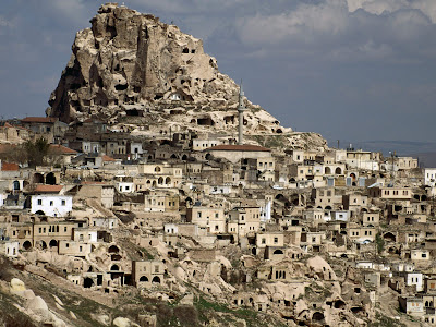
Ellie recommended me to look those cliff dwellings in Cappadocia, Turkey, to see how to adjust forms into its condition. Our school's monolithic array of classrooms stood out in too extreme way, as opposed to those Cappadocia dwellings carved out of nature. Public area in front of those classrooms should also be harmonized (not making stark difference at least).

It was good to think about the light and the location of entrance though. What I learned from other's presentation is that we also need to consider the light in very constant way. Sunlight is not a section but a gradiation, so it was good to point out that the building should be aware of this gradiant movement rather than thinking only by our shade sections.

In summary, we would have to improve

- How the actual building might work while keeping our concept
- Reconsideration of form
- Parts to whole relationship
- (additionally) clarifying each amount of natural light and artificial light
- (it's personal) presentation skill


Monday, September 28, 2009

09/27/09 a couple alternatives of program distribution


We have 3 issues(parameters) important on our site:
light/darkness, individual/shared, and time

Laura and I have been constructing diagrams- one for the relationship between light/darkness and individual/shared, another for relationship between light/darkness and time ( I think this is what Karl called "designing program", since we are defining programs in our own way).

Of all three important issues we are supposed to take light/darkness as our priority. ( guess it might be as same as the rest of the team) Yet we both agreed that we are putting as much light as possible into our school. And if so, I didn't think we need to worry too much about massing. In a way the building mass can be very similar to "mountain dwellings" in copenhagen. Thus how we can connect shared/individual space in such premise will give us our own specified design.

What I have been doing tonight was some sketches for the program distribution . In the sketch I marked all shared spaces as yellow while individual spaces are white. Light/darkness strategy is shown in the section in which the mass on north is relatively higer than south. shared/individual strategy is shown in diagram in the middle. I tried to make a reasonable connection between individual rooms and shared rooms. (For instance we need to make every student to get to courtyard easily, without having any student to cross other classrooms)


It's always hard to make fast progress from the beginning, yet it seems we could clarify ideas and design strategies faster as time goes by.

Thursday, September 24, 2009

09/24/09 In between analysis and design


For a couple of days from Tuesday, we have been creating 6 sets of sections for the site again. Compared to the previous one, this section includes the shade only for the site. By arranging shades along the time and month we were able to see the gradual change of shades as well as stark difference of shades depending on the time (whether it is 8 in the morning or at noon.)

We also worked on the desired amount of light in each program. Classroom might require much more light during the class than the very in the morning. For dining hall it doesn't have to be bright everyday except for lunch/snack time.

By setting up our own conditions of programs and placing them into right spot in the site, we are expecting mass strategies out of it. (This probably is the thing we should have done already, yet we feel better that we made a clear analysis which is going to be helpful throughout the whole process)

What I am planning to do is to try as various material as possible for making physical model. Clay, Pink foam, card board, anything works better with constructing "A chunk" would be a good material to deal with.


Tuesday, September 22, 2009

09/22/09 Self evaluation of first pin-up

In summary,

The good point we have is that we got a clear concept/topic of what we are going to process further for the project. I think the presentation we had was more a bit of conceptual introduction (focusing on the image of futurism and movement) than being practical or analytic about the site.
We are focusing from September to May, from 8 a.m to 4 p.m.
So 3 times in a day, twice in a month, for 9 months makes 54 results for shadows. Another good point we did is, in my point of view, that we cut the 27 sections (half of 54) to see where the shadows are darker/lighter.
By arranging program along the helioscopic bar, we would be able to sort out which space requires more light than others. This would eventually lead us to get rid of leftover chunk of mass from the site.

One problem I think now is if we actually can see the brightness and darkness of the site through this section, for there is a building behind which is shown as very dark shadow.

I wish we could have shown our video faster and smoother. And I thought there should be one person who is in charge of making slides, since it was quite hard for us (or me) to manage slides in a same fashion ( in terms of using colors, fonts, and even dispositioning of images).

I was able to see similar consequences in other teams' models and drawings, but i was intrigued by various ways of each team to make those consequences look different. Below are points I wrote down from each team.


Chelsea/Chris
- point-> line -> surface -> volume, was able to see volumes out of surface
- good strategy: cropped out view only for site
- be careful to make a fixed one view in order to compare images

Jim/Branden/Peter
-liked the point that they compared amount of shadow of each time of the day by making imaginary cube on the site, cropping the shadows which falls only on the site.

Lisa/Danielle
- good: overlayed shadow image as well as separate shades
- a drawing and a photograph should be different
- programs can also move around
- make sure the background of slides has the same color as the picture
Ashley/Caithlin
- small discussion: windows in school always on the left side , in consideration of right-handed students. ( I thought it's funny in Korea every guy in my age is required to do militery servies and if they are not right-handed they would be in trouble when using their gun, for every gun is designed only for right-handed. )
- How does each species influence the changes on the environment
- need to see not only bright versus dark but also if it's being controlled/uncontrolled.

Dave/Andrew
- How you decide your front depending on the light
- relections of the area as another layers
- clouds and snows make even brighter sky , due to the bouncing light

Sunday, September 20, 2009

Tips from Tutorial 3 + shadowing tutorial


-extrude
-pocket: click the skecth -> up to next -> making hole no matter how
-chamfer: set up diameters for chamfer
-shell
products
-parts - geometrical set ( for sketches and surfaces)
- body (for sketches, surfaces and solids)

- as long as things are in same body they are all unioned.
- be careful about labeling files : mark your date
- parameter : solar azimuth/ solar elevation
- ways to construct shadow lines
: line definition -> point and direction -> set up direction by using parameters
- ways to make surface : fill and join together
- way to make solid: make closed surface

Getting into design process,


So finally at this point Laura and I was almost done with shadowing our digital site.

( Though I might have to fix some imperfections for shadows)

We are now about to suggest ideas for the site, what Laura suggested was the futurist painting.

As her favorite painting by Duchamp shows, it expresses movement of person by drawing continual change of his/her position on top of each. In a way shadow is doing the same as the sun moves. We haven't gotton to the deeper point yet, so this is going to be further discussed tomorrow. Yet at least I think this (though very conceptual at this point) idea might be able to provide us different ways of approaching our site, rather than being too practical/technical.